Preview
To preview your prototype press the Preview button in the Protowire panel. To update the prototype when you have changed your design, just press the Preview button again. To view the prototype on a mobile device, open the preview menu by clicking on the window's title and select Show URL. Scan the QR code with your smartphone's camera app. It should open the URL in a browser. When you open the prototype for the first time you have the option of saving it to the home screen so it opens full screen or you can view it non-full screen. When you press the Preview button in Sketch the prototype will automatically reload on the mobile device. If it doesn't it might have lost connection to Sketch, in which case refresh the web page or re-open the fullscreen webapp.
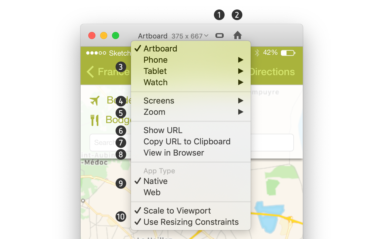
- Screen Orientation Switch between portrait and landscape. This option is only available when Resizing Constraints is checked and the current screen size preset has portrait and landscape sizes.
- Home screen Goes to the home screen of the prototype.
- Screen sizes If the prototype type is native, the screen sizes will be the size of the device screen. If it is web, it will be viewport size i.e. the visible area in a browser. You can also resize the window manually by dragging the window edge. Artboard sets it to the size of the home artboard.
- Screens Jump to a particular screen in the prototype.
- Zoom Zoom in or out
- Show URL Shows the prototype URL as text and as a QR code. On iOS 11 you can use the camera app to scan the QR code. On Android you will need to download a QR reader app like QR Code Reader.
- Copy URL to clipboard If you are using an iPhone you can copy the prototype URL to your MacOS clipboard and paste it on your iPhone.
- View in Browser Opens the prototype in the default browser.
- App Type A "native" prototype is the size of the screen while a "web" prototype can extend beyond the bottom of the screen and have a vertical scrollbar.
- Scaling If checked the prototype will scale proportionally to the size of the viewport otherwise it will be at 100%. If "Use Resizing Constraints" is checked it will scale non-proportionally and use resizing constraints in the design to scale elements.