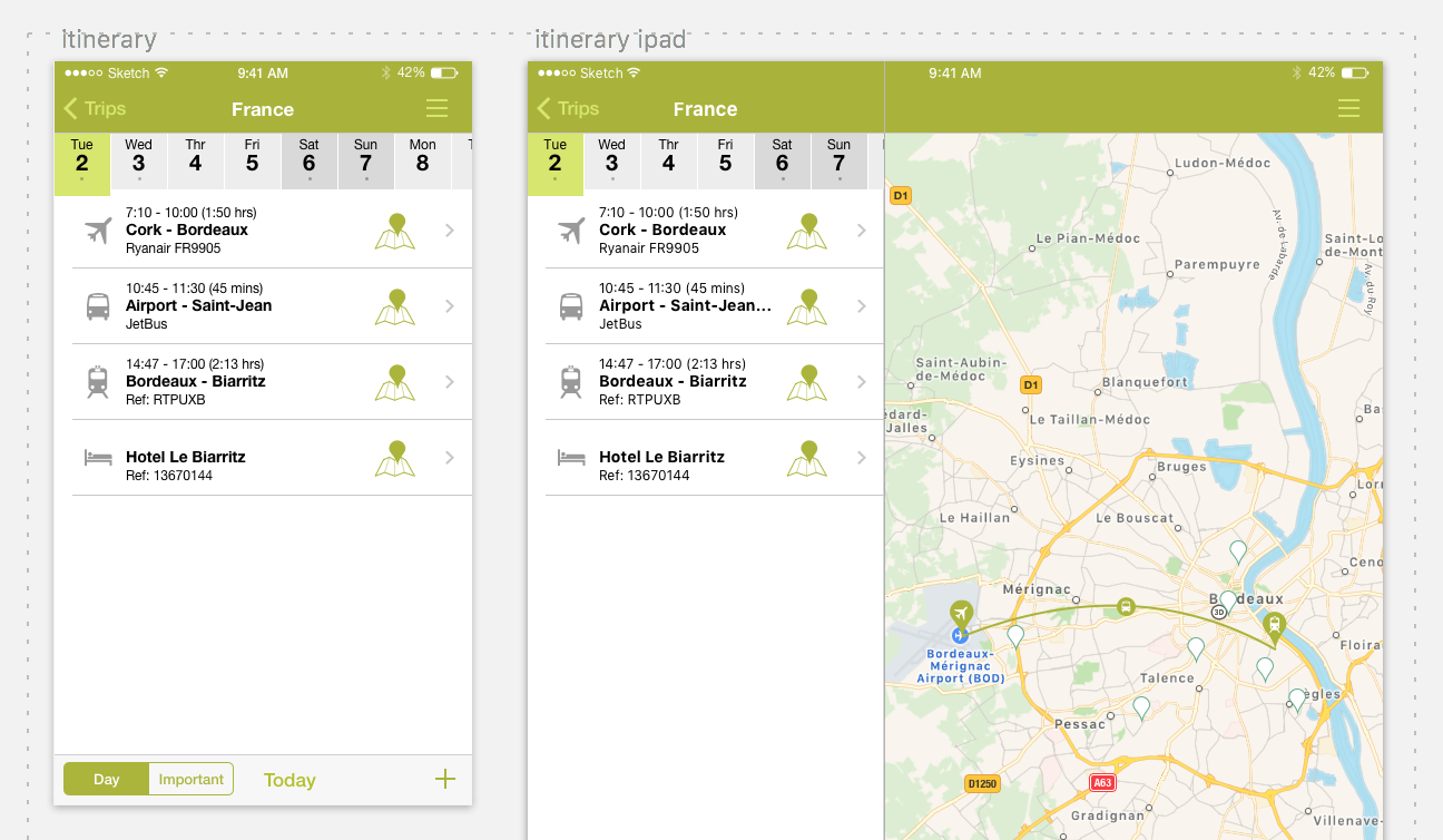
Responsive Artboard Groups

Responsive artboard groups allow you to switch the artboard that is shown depending on the size of the screen. For example you might have one artboard for smartphone and another for tablet. You don't have to have variants for each screen. Using resizing constraints your mobile artboards might be able to scale up to tablet.

You can group artboards into responsive artboard groups either manually or automatically. To do it manually select the artboards and click on the menu icon in the Protowire panel in the bottom right and select Group Responsive Artboards from the drop down menu. To do it automatically select Auto Group Responsive Artboards from the menu. This will automatically group artboards by their name i.e. if they start with the same text, they will be put into a group e.g. "inside mobile" and "inside desktop" or "inside" and "inside mobile". You would normally turn this on for websites where every desktop artboard will have a corresponding mobile artboard. To ungroup, select one of the artboards in the group and select Ungroup Responsive Artboards from the drop down menu.